Here’s What’s New In Zangi Version. 4.0
The team at Zangi just released the newest update to our messaging app: Version 4.0. We’ve worked to make our most popular features even better, and our app even easier to use. We packaged it all in our completely new design and branding. Here are some of the features:
Branding and Logo Design:
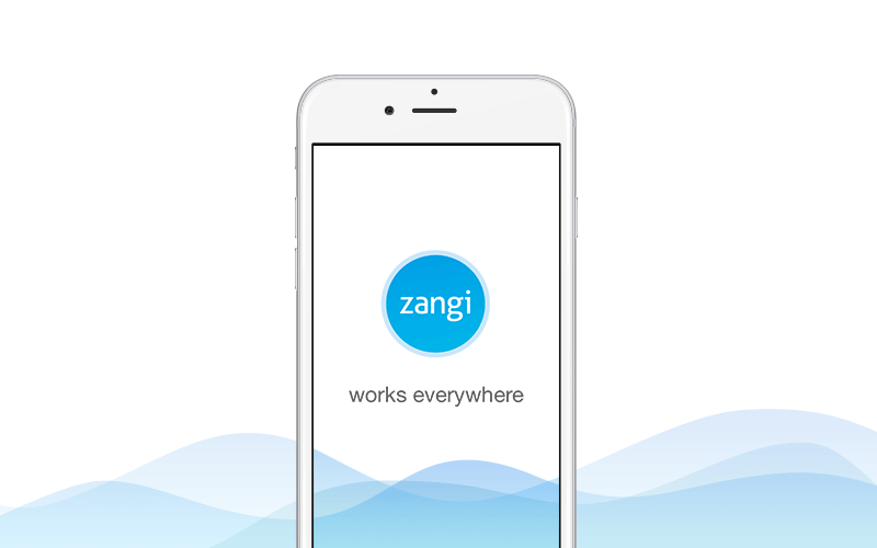
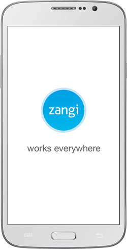
First things first. We’re proud to announce that our newest release comes with a completely new user interface, color scheme, and branding.
Though it wasn’t easy, we finally decided to replace our orange layout in favor of a light blue scheme. We love blue, and according to our research, so do most people. The color of clear skies, calm lakes and tranquility have come to be associated by people around the world with dependability and loyalty. Unlike the more aggressive orange, the new lighter blue design better reflects our team’s commitment to providing a secure and harmonious user experience for our customers. The use of blue also represents our team’s commitment to inclusivity. Facebook of the population being red-green colorblind, blue ensures that everyone can easily enjoy our app. We know that change isn’t always easy, but we’re confident that you’ll quickly see why we love this new design change so much!
We’ve also ditched our abstract orange logo for a minimalist white phone icon. This way, you’ll get a better understanding of Zangi’s communication features. We haven’t totally broken with tradition, however, since our text logo retains our original font in blue.

Smoother User Experience:
You told us what you thought of our previous version, and we listened! Zangi 4.0 will be smoother and more intuitive than ever!
Our newest update takes care to improve the experience that you know and love, without compromise. Not only is the app even easier to use than before, but it also has the boosted performance to show for it.
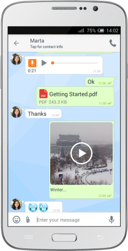
In addition to video and audio messages that you’ve come to expect from our previous versions, we now allow users to share just about any type of file directly on the app. We even streamlined the photo-browser to allow people to swipe to close an already-opened photo in full-screen mode. We’ve also paid close attention to how you use our app to make it feel as natural as breathing. Try it out for yourself!

Our Best Feature is now even Better:
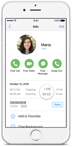
Despite attempts by industry leaders like Whatsapp, Zangi still boasts of the lowest bandwidth consumption in the market. You won’t notice any compromise in call quality, no matter where you’re calling from. Not only is our low-bandwidth performance even more seamless, users can now see exactly how much bandwidth they are using at any given moment.

We’ve got more exciting updates and news to share with you, so keep in touch on the Facebook page!


Leave a Reply